大约 8 分钟
表格
概述
基于IViewUI的table组件二次封装的表格组件next-table,主要用于展示大量结构化数据。
支持筛选、分页、自定义操作等复杂功能。
代码示例
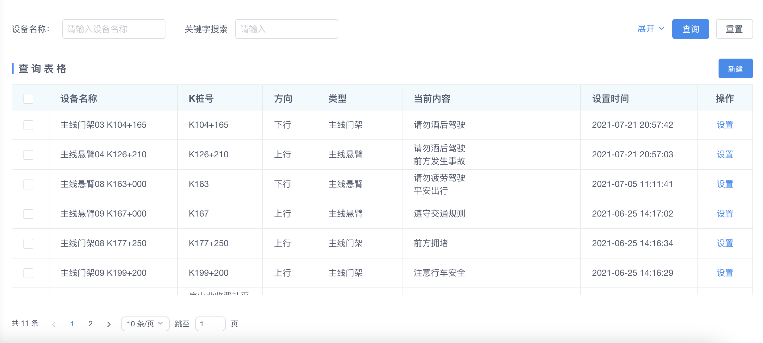
<template>
    <next-table
        ref="dataTables"
        :columns="TableColumns"
        :toolbtns="toolbtns"
        url="/infra/board/template/page">
        <template slot-scope="{ row }" slot="content">
            <div
            class="board-content"
            :class="row.dataExpand ? 'expand' : 'noexpand'"
            >
            <div class="content-div">
                <template v-for="item in row.contentList">
                <div class="board-content-item back" :key="item.id">
                    <span class="content">{{ item.content }}</span>
                    <span class="split"></span>
                </div>
                </template>
            </div>
            </div>
        </template>
        <template slot-scope="{ row }" slot="action">
            <div @click.stop.prevent>
                <a type="text" class="action-btn info" @click="settingBoard(row)">设置</a>
            </div>
        </template>
    </next-table>
</template>
<script>
    // import NextTable from '@/components/next-table';
    export default {
        name: 'ExampleThird',
        components: {
            // NextTable
        },
        data () {
            return {
                TableColumns: [
                    {
                        type: 'selection',
                        width: 60
                    },
                    {
                        title: '设备名称',
                        key: 'name',
                        resizable: true,
                        align: 'left',
                        minWidth: 120,
                        search: {
                            type: 'input'
                        }
                    },
                    {
                        title: 'K桩号',
                        key: 'pileNo',
                        //   slot: "typeDesc",
                        resizable: true,
                        align: 'left',
                        minWidth: 50
                    },
                    {
                        title: '方向',
                        key: 'directionName',
                        resizable: true,
                        align: 'left',
                        tooltip: true
                    },
                    {
                        title: '类型',
                        key: 'typeName',
                        resizable: true,
                        align: 'left',
                        tooltip: true,
                        minWidth: 50
                    },
                    {
                        title: '当前内容',
                        key: 'content',
                        slot: 'content',
                        resizable: true,
                        align: 'left',
                        tooltip: true,
                        ellipsis: true,
                        minWidth: 200
                    },
                    {
                        title: '设置时间',
                        key: 'setDate',
                        resizable: true,
                        align: 'left',
                        minWidth: 100
                    },

                    {
                        title: '操作',
                        key: 'action',
                        slot: 'action',
                        align: 'center',
                        show: true
                    }
                ],
                toolbtns: [{
                    id: 'add',
                    name: '新建',
                    type: 'primary',
                    icon: '',
                    click: this.addData
                }]
            }
        },
        methods: {
            addData (rows) {

            },
            settingBoard (row) {

            }
        }
    }
</script>
API
Next-Table props
next-table的参数支持IViewUI的原生参数,同时增加了以下自定义参数
| 属性 | 说明 | 类型 | 默认值 |
|---|---|---|---|
| url | 数据源请求的接口地址 | String | - |
| toolbtns | 表格上方右侧的操作按钮 | Array | [] |
| tableName | 表格名称 | String | '' |
| beforeRequst | 表格请求数据源的接口发送之前的处理函数,第一个参数为传送给接口的参数,第二个参数是回调函数callback。可以在此对第一个参数进行处理,处理完毕以后调用callback(params) 将处理后的参数传回去,这样在请求发送的时候就会带上新的参数。 | Function | null |
| requestCallBack | 数据源请求返回以后的处理函数,第一个参数为返回结果,第二个参数是回调函数callback。可以再此对第一个参数返回结果进行处理,处理完毕以后调用callback(data) 将处理后的结果传回去,这样表格拿到的请求结果就是我们处理后的结果。 | Function | null |
| requestMethod | 数据源接口请求方式 | String | post |
| pageSize | 表格每页显示的数据条数 | Number | 10 |
| pageNo | 当前显示表格数据的第几页 | Number | 1 |
参数示例
beforeRequst
<template>
<next-table
    ref="dataTables"
    :columns="TableColumns"
    :toolbtns="toolbtns"
    :beforeRequst="beforeRequst"
    url="/infra/board/template/page">
</next-table>
</template>
<script>
export default {
    ...
    methods: {
        beforeRequst (params, callback) {
            // 只查询name 为 '测试' 的数据
            params.name = '测试'
            callback(params)
        }
    }
    ...
}
</script>
requestCallBack
<template>
<next-table
    ref="dataTables"
    :columns="TableColumns"
    :toolbtns="toolbtns"
    :requestCallBack="requestCallBack"
    url="/infra/board/template/page">
</next-table>
</template>
<script>
export default {
    ...
    methods: {
        requestCallBack (data, callback) {
            // 从第二个开始,删除9个元素
            data.list.splice(2, 5)
            callback(data)
        }
    }
    ...
}
</script>
column props
表格的 column 参数也支持IViewUI中cloumn原生参数。此外,还增加了以下参数:
| 属性 | 说明 | 类型 | 默认值 |
|---|---|---|---|
| show | 是否显示该列 | Boolean | true |
| search | 表格筛选条件,如果配置了该项,将在表格上方展示对该列的筛选,可以来筛选数据。search中的type属性用于指定当前筛选条件的类型,有:input、select、treeSelect、radio、checkbox、switch、date等7种类型 | Object | null |
search props
| 属性 | 说明 | 类型 | 默认值 |
|---|---|---|---|
| type | 必需项,筛选条件展示类型:input、select、treeSelect、radio、checkbox、switch、date等7种类型 | String | '' |
| searchKey | 非必需项,默认查询的参数是该项column中的key属性的值,但如果要在筛选的时候指定该项需要用其他字段来传递给接口查询,就可以配置此项。 | String | - |
| clearable | 非必需项,筛选条件是否可以清除, 对input、radio、checkbox、switch、select、treeSelect类型有效 | Boolean | true |
| multiple | 非必需项,对select类型有效, 是否开启多选 | Boolean | false |
| defaultValue | 非必需项,筛选条件的默认值 | - | - |
| rules | 非必需项,筛选条件的表单校验规则:详见IViewUI中form组件的rules校验规则 | Array | - |
| style | 非必需项,筛选条件呈现组件的特殊样式 | [Object, Array] | - |
| dataType | 非必需项,对input类型有效。输入框类型,可选值为 text、password、textarea、url、email、date、number、tel | String | text |
| maxlength | 非必需项,对input类型有效, 最大输入长度 | Number | 50 |
| showWordLimit | 非必需项,对input类型有效, 是否显示输入字数统计 | Boolean | false |
| url | 非必需项,数据源请求接口地址, 对radio、checkbox、switch、select、treeSelect类型有效 | String | '' |
| requestMethod | 非必需项,数据源请求接口请求方式, 对radio、checkbox、switch、select、treeSelect类型有效 | String | get |
| requstParams | 非必需项,数据源请求接口所需要的额外参数, 对radio、checkbox、switch、select、treeSelect类型有效 | Object | - |
| dicType | 非必需项,数据源通是通过字典值来获取,字典值, 对radio、checkbox、switch、select、treeSelect类型有效 | String | '' |
| options | 非必需项,本地自定义数据源, 对radio、checkbox、switch、select、treeSelect类型有效,为一个数组,采用这种格式:[{label:'',value:''}] | Array | [] |
| dateType | 非必需项,对date类型有效。日期显示类型,可选值为:date、daterange、datetime、datetimerange、year、month | String | daterange |
| format | 非必需项,展示的日期格式, 对 date 类型有效。yyyy-MM-dd、yyyy-MM-dd HH:mm:ss、yyyy、yyyy-MM | String | yyyy-MM-dd |
Next-Table Slots
next-table支持slot-scope 写法
在 columns 的某列声明 slot 后,就可以在 Table 的 slot 中使用 slot-scope。
slot-scope 的参数有 3 个:当前行数据 row,当前列数据 column,当前行序号 index。
示例:
<template>
  <Table :columns="columns" :data="data">
    <template slot-scope="{ row, index }" slot="name">
      <Input type="text" v-model="editName" v-if="editIndex === index" />
      <span v-else>{{ row.name }}</span>
    </template>

    <template slot-scope="{ row, index }" slot="age">
      <Input type="text" v-model="editAge" v-if="editIndex === index" />
      <span v-else>{{ row.age }}</span>
    </template>

    <template slot-scope="{ row, index }" slot="birthday">
      <Input type="text" v-model="editBirthday" v-if="editIndex === index" />
      <span v-else>{{ getBirthday(row.birthday) }}</span>
    </template>

    <template slot-scope="{ row, index }" slot="address">
      <Input type="text" v-model="editAddress" v-if="editIndex === index" />
      <span v-else>{{ row.address }}</span>
    </template>

    <template slot-scope="{ row, index }" slot="action">
      <div v-if="editIndex === index">
        <Button @click="handleSave(index)">保存</Button>
        <Button @click="editIndex = -1">取消</Button>
      </div>
      <div v-else>
        <Button @click="handleEdit(row, index)">操作</Button>
      </div>
    </template>
  </Table>
</template>
<script>
  export default {
    data () {
      return {
        columns: [
          {
            title: '姓名',
            slot: 'name'
          },
          {
            title: '年龄',
            slot: 'age'
          },
          {
            title: '出生日期',
            slot: 'birthday'
          },
          {
            title: '地址',
            slot: 'address'
          },
          {
            title: '操作',
            slot: 'action'
          }
        ],
        data: [
          {
            name: '王小明',
            age: 18,
            birthday: '919526400000',
            address: '北京市朝阳区芍药居'
          },
          {
            name: '张小刚',
            age: 25,
            birthday: '696096000000',
            address: '北京市海淀区西二旗'
          },
          {
            name: '李小红',
            age: 30,
            birthday: '563472000000',
            address: '上海市浦东新区世纪大道'
          },
          {
            name: '周小伟',
            age: 26,
            birthday: '687024000000',
            address: '深圳市南山区深南大道'
          }
        ],
        editIndex: -1,  // 当前聚焦的输入框的行数
        editName: '',  // 第一列输入框,当然聚焦的输入框的输入内容,与 data 分离避免重构的闪烁
        editAge: '',  // 第二列输入框
        editBirthday: '',  // 第三列输入框
        editAddress: '',  // 第四列输入框
      }
    },
    methods: {
      handleEdit (row, index) {
        this.editName = row.name;
        this.editAge = row.age;
        this.editAddress = row.address;
        this.editBirthday = row.birthday;
        this.editIndex = index;
      },
      handleSave (index) {
        this.data[index].name = this.editName;
        this.data[index].age = this.editAge;
        this.data[index].birthday = this.editBirthday;
        this.data[index].address = this.editAddress;
        this.editIndex = -1;
      },
      getBirthday (birthday) {
        const date = new Date(parseInt(birthday));
        const year = date.getFullYear();
        const month = date.getMonth() + 1;
        const day = date.getDate();
        return `${year}-${month}-${day}`;
      }
    }
  }
</script>
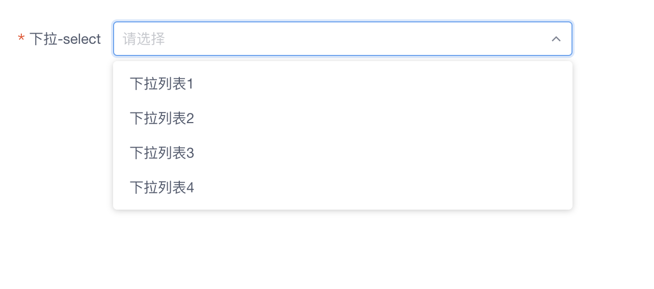
下拉选择器
概述
基于IViewUI的select组件二次封装的下拉选择组件next-select,使用模拟的增强下拉选择器来代替浏览器原生的选择器。
选择器支持单选、多选、搜索,以及键盘快捷操作。
代码示例
<template>
    <!-- 数据源为 url -->
    <next-select v-model="selectValue" url="/get/select/data"></next-select>

    <!-- 数据源为 字典类型 -->
    <next-select v-model="selectValue" type="selectData"></next-select>
</template>
<script>
export default {
    ...
     data () {
            return {
                selectValue: 1
            }
     }
    ...
}
</script>
API
Next-Select props
next-select的参数支持IViewUI的Select组件原生参数,同时增加了以下自定义参数
| 属性 | 说明 | 类型 | 默认值 |
|---|---|---|---|
| url | 数据源请求的接口地址 | String | '' |
| type | 数据源是通过字典值的方式来获取,字典值 | String | '' |
| requestMethod | 数据源请求接口请求方式, | String | get |
| requestParams | 数据源请求接口所需要的额外参数 | Object | - |
| deleteable | 选项是否可以删除 | Boolean | false |
| clearable | 是否可以清除,显示清除安宁 | Boolean | true |
| separator | 多个选择结果之间的分隔符,对开启多选multiple:true, 有效 | String | , |
| filterable | 是否可以筛选 | Boolean | true |
| notCache | 是否关闭缓存,为减少数据源请求频率节约性能和拥有更好的交互体验,数据源会在第一次请求回来以后存在本地sessionStorage缓存中,如果sessionStorage缓存中有就不再发送请求。如果设置为true,则每次都会发送请求获取数据源 | Boolean | false |
Next-Select Events
next-select 将IViewUI原生Select组件的on-change事件改为了如下所述change事件,增加了下述事件,其他原生事件保持不变。
| 事件名 | 说明 | 返回值 |
|---|---|---|
| change | 选中的Option变化时触发,返回处理后的结果。 | 当前选中项 |
| select-delete-item | 删除选项时触发,返回当前删除项 | 当前删除项 |
Next-Select Slots
| 名称 | 说明 |
|---|---|
| default | 自定义Option列表 |